Peer Reviews and Instructor Feedback
MDM615 Week Two
Feedback from Bartley Argo
This feedback emphasized the need to refine the vision board to better communicate the brand’s personality and intent. The suggestion to readjust the Onlyness Statement into a more psychographic approach was helpful, as it pushed me to think about the audience’s mindset rather than just demographics. Revisions were made to the vision board by aligning imagery more closely with the chosen shapes, clarifying textures, and ensuring the pattern supports the overall aesthetic. Also, replacements to the logo-like imagery with more evocative brand visuals. These refinements created a stronger emotional connection and prepared the vision board to be more compelling for stakeholders.


MDM620 Week Two
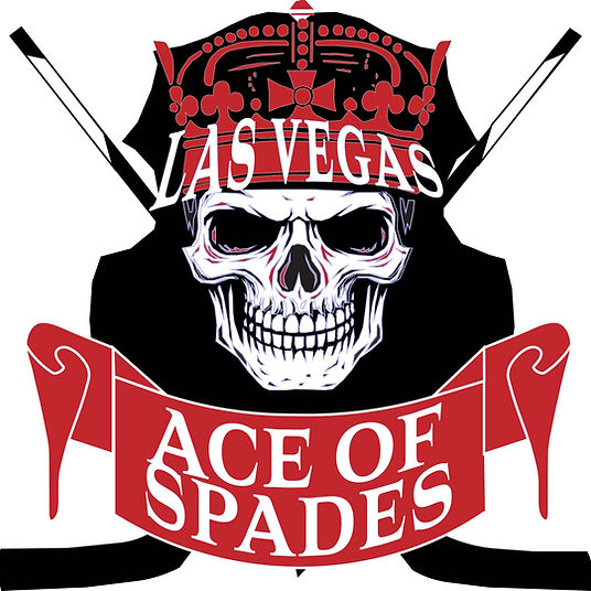
Adam Baldowski Feedback
Dr. B’s feedback affirmed that the logo development is off to a strong start while encouraging to strengthen the process. The reminder to replace AI-influenced sketches with hand-drawn iterations was helpful, as it reinforced the importance of showing personal creative evolution. The response was recreating images adding visible refinements with notations and exploring five iterations for each concept to deepen design exploration. Converting line drawings into fully realized shapes improved clarity and scalability, and revisiting the rationale ensured each logo better reflects the intended brand personality. This feedback guided meaningful refinements and elevated the overall quality.
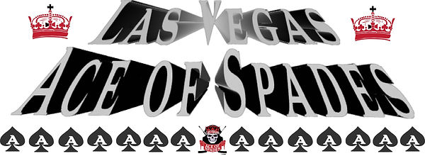
MDM650 Week One
Feedback from Andrea Kratz
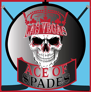
This feedback highlighted the importance of deeper research on the team’s name and its potential sensitivities, which was helpful in ensuring the brand would be well-received by its audience. Revisions to the name’s cultural implications and considered alternative options that avoided negative connotations. The suggestion to reinforce the gritty image of the hockey player and align all elements with the edgy sketches prompted revisions to the vision board with more aggressive, grungy imagery. Also adjustments to the jersey designs were made by incorporating sharper lines and a lightning bolt motif to communicate energy and fearlessness, creating a stronger, unified visual identity.
MDM650 Week Two
Feedback from Andrea Kratz
The feedback focused on refining the brand identity for clarity and cohesion. The suggested team name revision reduces cultural sensitivity concerns and prevents misinterpretation. Logo adjustments, such as removing outlines, improve readability, while considering a shield background with hockey sticks strengthens the visual connection to the sport. Recommendations to eliminate the blue box and reduce envelope assets simplify the design, ensuring functional use. Attention to letterhead alignment and border busyness enhances consistency across applications. Overall, the feedback was helpful, guiding practical refinements to improve legibility, cultural sensitivity, and visual cohesion across the brand materials.
MDM640
Measuring Design Effectiveness
Brand Playbook Peer Evaluation Form, Week 4
Feedback from Jazel Maldanado
This feedback confirmed that the style guide effectively reflects the brand’s vision board, maintains consistency, and appeals to the intended audience. Appreciation for the acknowledgment of the organized layout, strong contrast for legibility, and the quality of images and assets. The most helpful critique addressed the typography inconsistencies, which could disrupt cohesion and professionalism. In response, revisions were made to the guide by standardizing fonts for all informational text and double-checking margins and alignment to ensure a polished look. This feedback strengthened the attention to detail and reinforced the importance of visual consistency to accurately convey the brand’s personality and intent.
MDM640
Measuring Design Effectiveness
Brand Playbook Peer Evaluation Form, Week 4
Feedback from Ravyn McCollins
This feedback affirmed that the style guide successfully communicated the brand’s voice, tone, and visual personality while following the example guide’s structure. The recognition of cohesive colors, typography placement, and well-expressed narratives was encouraging. The most helpful insight focused on improving clarity by adding more reference images to strengthen the connection between the vision board and media assets, as well as creating an alternate logo for small-scale applications. Revisions to the guide were made by adding these references and designing a simplified, stroke-free logo variation to ensure legibility across sizes. This feedback helped elevate both clarity and functional usability.

MDM640
Measuring Design Effectiveness
Brand Playbook Peer Evaluation Form, Week 4
Feedback from Jazmine Pickens
This feedback confirmed that the style guide successfully communicates the intense, gritty personality of the brand through its tone, color palette, and typography. I Appreciation for the recognition of consistent language and well-thought-out mechanics. The most helpful critique highlighted the need to improve text readability by adjusting text box colors and to better demonstrate the logo in real-world applications, such as uniforms and merchandise. Revisions were made to the guide by testing black and red text boxes for contrast, ensuring legibility, and adding mockups that showcase the logo in context. These changes strengthened both clarity and the practical application of the brand.