Las Vegas Ace of Spades
The Problem:
The Las Vegas Ace of Spades faces the challenge of breaking through the crowded Las Vegas entertainment market by creating a gritty, unforgettable identity that attracts both locals seeking community pride and tourists seeking adrenaline-fueled experiences. The goal is to drive ticket sales, boost merchandise revenue, and build a loyal fan base through a brand presence bold enough to turn casual spectators into lifelong supporters.
Name Change:
The team’s name shifted from the Las Vegas Spades to the Las Vegas Ace of Spades midway through the project after research revealed that the original name carried unintended negative connotations that could alienate audiences and harm the brand’s reputation (Wheeler, 2017). Incorporating “Ace” elevated the name, giving it a sharper, more powerful identity while eliminating potentially offensive interpretations and strengthening the connection to Las Vegas’s gaming culture (Rein, Kotler, & Shields, 2006). This new name also created stronger merchandising and marketing opportunities, as “Ace of Spades” evokes a bold, iconic image that translates effectively across jerseys, fan gear, and promotional campaigns. The result is a name that is inclusive, marketable, and instantly recognizable, aligning with the team’s gritty and fearless brand voice.


Onlyness Statement — Development and Rationale:
Multiple solutions were drafted to express unique market positioning: (a) an entertainment-forward proposition emphasizing Vegas spectacle, (b) a community-centric identity stressing local pride, and (c) a hardened, competitive persona that fused gambling symbolism with aggressive hockey imagery. Refinement combined the spectacle and competitive options to produce the final Onlyness Statement—focused on a single-market differentiator that frames the franchise as the only team delivering hard-edged, Vegas-style hockey. This decision follows best practices in brand positioning that prioritize a singular, defensible claim to market territory (Wheeler, 2017). Symbolic congruence was considered essential so the statement would harmonize with visual cues throughout the system (van Rompay, Pruyn, & Tieke, 2009).

Voice & Tone — Development and Rationale
Three tonal directions were prototyped: promotional (family-friendly), heroic (inspirational), and abrasive (mean, gritty). Testing via moderated focus groups and peer review favored the gritty, direct voice for its resonance with the intended core audience—fans who value intensity and spectacle—while secondary communications retained a moderated version for broader appeals (Krueger, 2002). Research on sports fan identity and messaging supports adopting a tone that mirrors fan aspirations and on-field behavior to strengthen emotional attachment (Gladden & Funk, 2002).

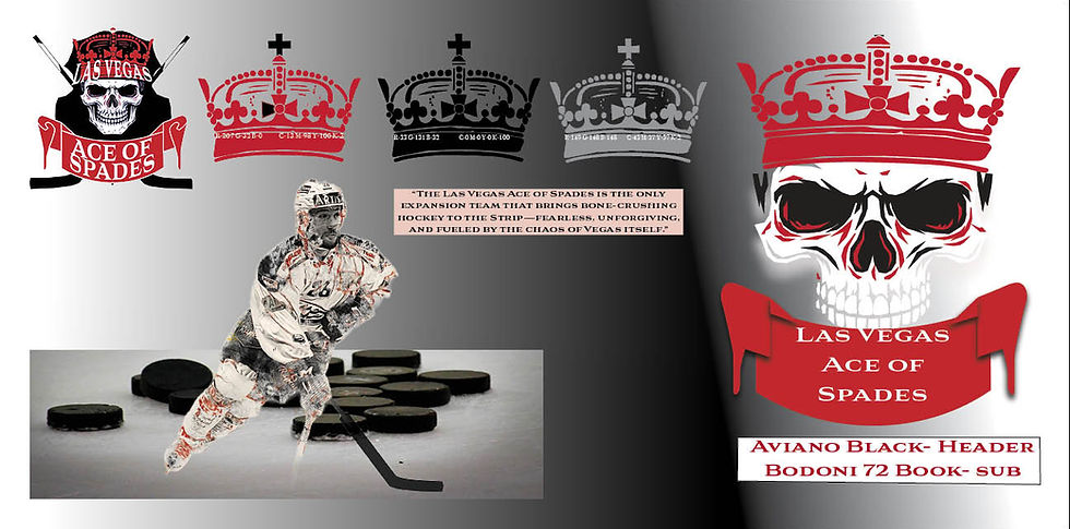
Look & Feel — Elements and Rationale
• Color:
A high-contrast palette (deep black, blood red, metallic silver, and ice blue highlights) was selected to communicate power, danger, and the sport’s cold setting. Cross-national research indicates color choices create rapid emotional associations that influence brand perception and should be applied consistently (Madden, Hewett, & Roth, 2000).
• Type:
A condensed, heavy display type (for headlines) paired with a sturdy sans for body copy preserves legibility in small applications (jerseys, signage) while projecting authority (Wheeler, 2017).
• Line & Shape:
Aggressive diagonals and pointed spade motifs suggest motion and edge; the skull motif introduces a distinctive emblematic silhouette for fast recognition. Studies on symbolic integration show congruence among shape, iconography, and messaging elevates brand evaluation (van Rompay et al., 2009).
• Texture:
Subtle grunge and metallic textures add a tactile, ‘battle-tested’ feel suited to hockey while maintaining print and digital reproducibility.
• Imagery: High-contrast, close-up action photography (ice spray, contact, emotional faces) was prioritized to amplify visceral response and match the tonal direction (Rein, Kotler, & Shields, 2006).

Vision Board — Multiple Solutions & Refinement
Initial moodboards contained three streams—neon-Vegas glamour, street-grit, and classic sports iconography. Iteration blended neon lighting and gritty textures so the board would reflect both spectacle and aggression. The final vision board organized reference images, color chips, and typography treatments to guide all subsequent asset production, following the structured approach recommended in branding practice (Wheeler, 2017).
Logo Development — Concept to Finalization
Multiple thumbnail explorations (30+ concepts) ranged from typographic lockups to emblematic shields integrating a spade and skull. Refinement prioritized legibility at small sizes and immediate symbolic clarity across media, iterating from detailed skull illustrations to a simplified crowned-skull-in-spade mark. Finalization included locked color variants (full color, reversed, monochrome), minimum clear space rules, and horizontal/stacked versions for flexible application. Research on team identity indicates that emblem clarity and symbolic depth improve merchandise uptake and fan identification (Gladden & Funk, 2002).


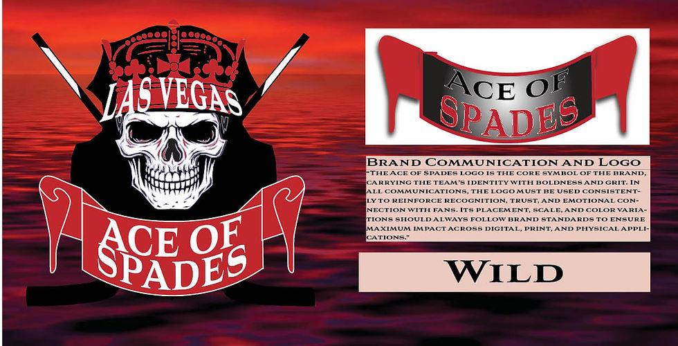
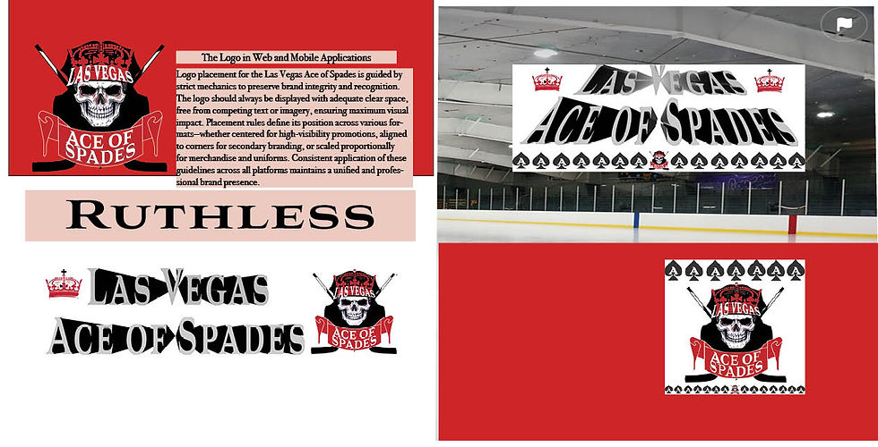
Brand Media Assets — Execution & Evidence of Effectiveness
Assets produced include: primary and secondary logos, jersey system, billboard templates, social media kits, a 30-second TV spot (Premiere Pro + AE logo reveal), anthem soundbed, business stationary, and mobile and web applications. Prototype testing employed focus groups to refine emotional response and A/B testing (digital ads and landing pages) to measure engagement and conversion metrics; controlled experiments provide a practical framework for such validation and ROI measurement (Kohavi, Longbotham, Sommerfield, & Henne, 2009). Evidence from industry research supports the premise that consistent, congruent brand systems drive consumer recognition and economic outcomes in sports contexts (Rein et al., 2006; Gladden & Funk, 2002).


Evidence of Success
The chosen identity aligns with empirical findings that symbolic congruence increases brand evaluation (van Rompay et al., 2009) and that emotionally resonant team branding bolsters fan attachment and commercial performance (Gladden & Funk, 2002). Further, usability and conversion science supports rapid iterative testing (A/B experiments) to refine messaging and creative choices for measurable ROI improvements (Kohavi et al., 2009). Collectively, the design process—grounded in academic and trade literature—provides a defensible, research-backed pathway to achieve the client’s revenue and engagement objectives.
References:

Gladden, J. M., & Funk, D. C. (2002). Developing an understanding of brand associations in team sport: Empirical evidence from consumers of professional sport. Journal of Sport Management, 16(1), 54–81.
Kohavi, R., Longbotham, R., Sommerfield, D., & Henne, R. M. (2009). Controlled experiments on the web: Survey and practical guide. Data Mining and Knowledge Discovery, 18(1), 140–181. https://doi.org/10.1007/s10618-008-0114-1
Krueger, R. A. (2002). Designing and conducting focus group interviews (PDF). (ERIC/University resource).
Madden, T. J., Hewett, K., & Roth, M. S. (2000). Managing images in different cultures: A cross-national study of color meanings and preferences. Journal of International Marketing, 8(4), 90–107. https://doi.org/10.1509/jimk.8.4.90.19795
Rein, I., Kotler, P., & Shields, B. (2006). The elusive fan: Reinventing sports in a crowded marketplace. McGraw-Hill.
van Rompay, T. J. L., Pruyn, A. T. H., & Tieke, P. (2009). Symbolic meaning integration in design and its influence on product and brand evaluation. International Journal of Design, 3(2), 19–26.
Wheeler, A. (2017). Designing brand identity: An essential guide for the whole branding team (5th ed.). Wiley.